Element Types
The complete list of elements and their types is available below. Select an element to learn more information about it.
Element Categorization
The Element Toolbox displays elements based on the active tab in Studio. Elements are categorized based on their functionality, which are used to develop specific aspects of a project. Elements are categorized corresponding to the Studio tabs: the Embedded tab, Application tab, and the Cloud tab.
In general, elements that help build embedded firmware are displayed in the Element Toolbox while in the Embedded tab, and elements that create the interface are displayed while in the Application tab. However, not all elements are inherently tied to a specific tab, and some elements are accessible in multiple tabs.
| Type | Description |
|---|---|
| Functional | Functional elements perform background operations for a project’s interface. These may range from performing specific tasks, to storing data, to establishing communication between the device and a third-party service. |
| Visual | Visual elements create an application’s visual functionality and interactivity. When added into the Studio canvas, visual elements also add a corresponding visual component to the Application tab’s app builder. These elements are event-driven, and react to user interaction and signals from their end devices. |
| Cloud | Cloud elements establish connectivity between a project and Atmosphere. Cloud elements are necessary to have a project’s embedded firmware and interface communicate with Atmosphere. These elements allow a project to send and have data stored on Atmosphere, interact with Atmosphere notifications, and more. |
Coupled Elements
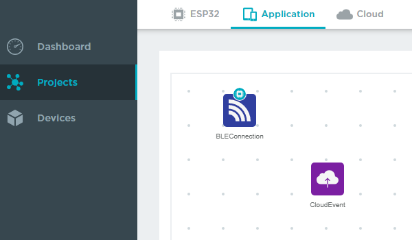
Coupled elements bridge a project’s functionality across one tab to another, and are represented by a tab badge on the element’s icon.

When a coupled element is added to the canvas, it creates a corresponding copy of it on an associated tab (likewise, deleting a coupled element will remove its copy). This allows the element to extend its functionality to that tab.
The following elements create coupled copies when added to the canvas:


